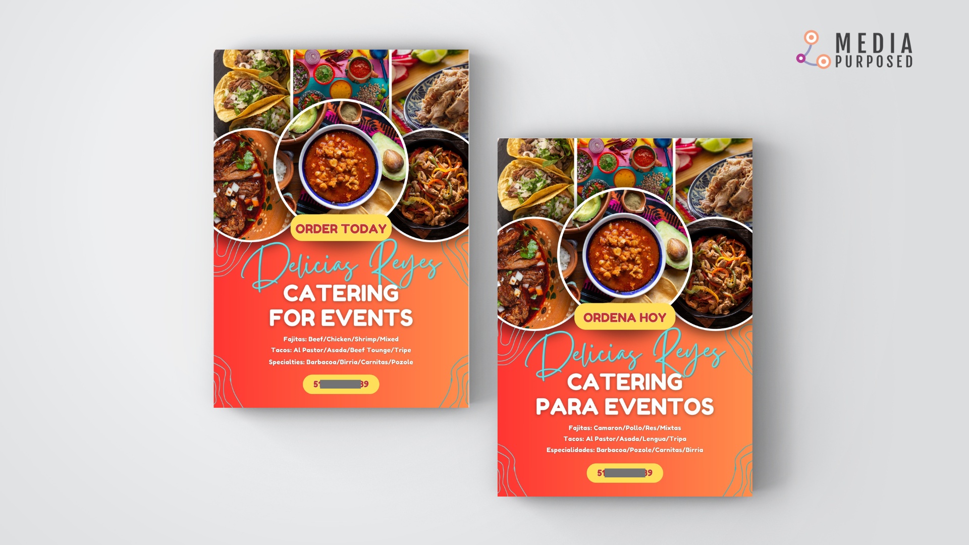
We were approached by an entrepreneur looking for print material to promote two businesses. He was specifically requesting printed flyers in order to have something tangible to distribute to local businesses and potential clients.
How he found us
I used to manage the social media for the church I formerly attended. The youth pastor was well aware of my creative skills. So when a congregant asked if he knew someone who could help create a couple of flyers, the youth pastor thought of me.
The youth pastor shared my contact information with the congregant. He reached out and asked if I was willing to help him by designing and printing flyers for his remodeling company. I said yes!
What he needed
We discussed his need for flyers. He is a hispanic business owner. So immediately, I thought he would benefit from having bilingual flyers. There is a growing Hispanic population in the greater Cincinnati area; therefore, this would allow Spanish speakers to feel comfortable while connecting with his business.
What we did
First, I requested he share what he had. He provided me with the following business cards:


While these get the information across, I immediately realized I wanted to elevate his approach to branding. I thought we needed to create something informative yet sophisticated, bold, and modern.
I am the first to admit I am not a graphic designer. However, I believe I am effective at communicating creatively. This means I have the ability to effectively showcare information in a manner that is appealing to the eye.
Judging from the two business cards you may notice the use of blue and black. These are the go to colors for many businesses. According to an article published in the Adobe Experience Cloud Blog, blue is associated with trust, security, and confidence, while black is believed to reflect value, prestige, and sophistication. However, no matter what the color may represent on its own, it is the way you use the color that matters most.
While the client was using blue and black, our idea was to employ a color palette that would draw attention without being predictable. So we thought of less conventional yet meaningful color options.
For his remodeling business, I came up with the following design:

While for the catering business, I designed the following:

The most important thing for both flyers was to use credible media. I scoured several media libraries to find photos with the best representation of the client’s business.
Tip: When using stock images, it is important to find photos that appear true to the business. They must be believable.
The challenge with this project was that the client had very little media or creative assets to be employed. That meant I had to get creative! I am a Canva power user, so naturally I looked for templates I could work with. The trick to successfully customize a template, is the creators ability to reimagine it. You must be able to tailor it and make it your own. I believe that is what I do best!!
If you would have a need for any communication or marketing materials, contact us today!!

